sc_toolbox.plot.average_expression#
- sc_toolbox.plot.average_expression(gene_expression, genes, order, id_label='identifier', xlabel='days', cluster='all', hue=None, palette='tab:blue', figsize=(15, 6), smooth=None, rotation=None, order_smooth=None, conf_int=None, scatter=None, save=None)[source]#
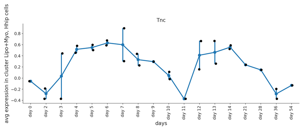
Draw a line plot showing the gene expression over time. Expression values are averaged by individual sample.
- Parameters:
gene_expression – Data frame containing gene expression values
genes – List of genes for which individual line plots will be generated
order (
List[str]) – Order of x-axis labels from left to rightid_label (
str) – Adata column in which sample id information is storedxlabel (
str) – x-axis labelcluster (
str) – Which clusters to plot. Select ‘all” if all clusters should be drawn.hue – Which value to color by
figsize (
Tuple[int,int]) – Size of the figure as specified in matplotlibsmooth – Set to true for smoothened line plot using polynomial regression
rotation (
Optional[int]) – set to True to rotate x-axis labels 90 degreesorder_smooth – If greater than 1, use numpy.polyfit to estimate a polynomial regression
conf_int – Size of the confidence interval for the regression estimate
scatter – Set to True to add average expression values per sample ID as dots
- Example smooth:
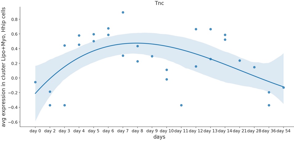
- Example raw: