sc_toolbox.plot.average_expression_split_cluster#
- sc_toolbox.plot.average_expression_split_cluster(gene_expression, genes, order, id_label='identifier', xlabel='days', hue='genotype', cluster=None, figsize=(15, 6), smooth=None, rotation=None, cols=None, tick_size=12, label_size=15, order_smooth=None, conf_int=None, scatter=None, save=None)[source]#
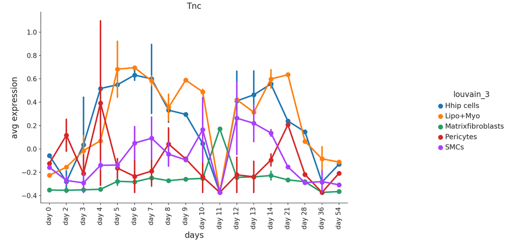
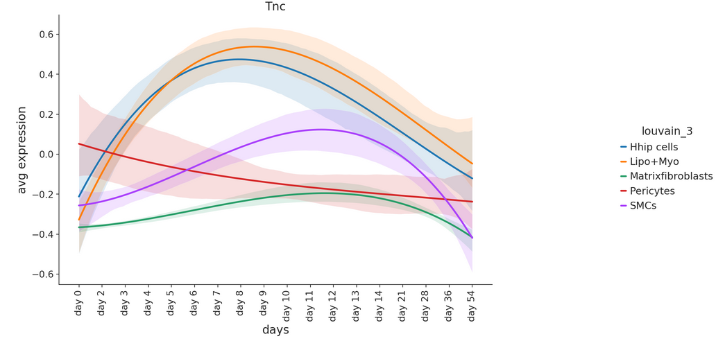
Plot average gene expression as line plots for multiple clusters at once.
- Parameters:
gene_expression – Data frame containing gene expression values
genes – List of genes for which individual line plots will be generated
order – Order of x-axis labels from left to right
id_label – Meta data column in which sample id information is stored
xlabel – x-axis label
hue – Split expression values by this grouping, one line per category, will be drawn
cluster – Which clusters to plot. Select ‘all” if all clusters should be drawn.
figsize – Size of the figure as specified in matplotlib
smooth – Set to True for smoothened line plot using polynomial regression
rotation – x-axis label rotation
cols – List of colors to use for line plot
tick_size – Size of the ticks as specified in matplotlib
label_size – Size of the labels as specified in matplotlib
order_smooth – If greater than 1, numpy.polyfit is used to estimate a polynomial regression
conf_int – Size of the confidence interval for the regression estimate
scatter – Set to True to add average expression values per sample ID as dots
save – Path to save the plot to
- Example smooth:
- Example raw: