sc_toolbox.plot.cluster_composition_stacked_barplot#
- sc_toolbox.plot.cluster_composition_stacked_barplot(relative_frequencies, xlabel='name', figsize=(6, 10), width=0.8, order=None, error_bar=None, label_size=15, tick_size=13, capsize=None, margins=(0.02, 0.04), colors=None, save=None)[source]#
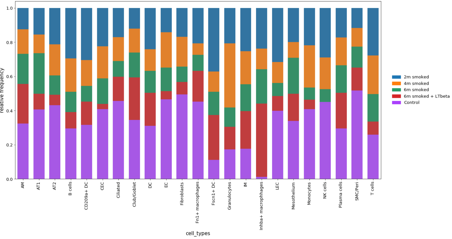
Plot relative frequencies as a stacked barplot.
- Parameters:
relative_frequencies (
DataFrame) – Data frame containing relative Frequencies as calculated by calc_relFreq()xlabel (
str) – x-axis labelfigsize (
Tuple[int,int]) – Size of the figure as specified in matplotlibwidth (
float) – Width of the barsorder – Order of x-axis labels from left to right
error_bar – Set to True to add error bars (only possible when grouping the frequencies)
tick_size (
int) – Size of the ticks as specified in matplotliblabel_size (
int) – Size of the labels as specified in matplotlibcapsize (
Optional[int]) – Size of the horizontal lines of the error barmargins (
Tuple[float,float]) – Change margins of the plot if desiredcolors – List of colors to use for the bands
Example